
Transparent glass in colored pencil: what to leave untouched
Study a simple glass through reserved paper, small accents, and interrupted edges. A dry-pencil exercise for suggesting transparency.
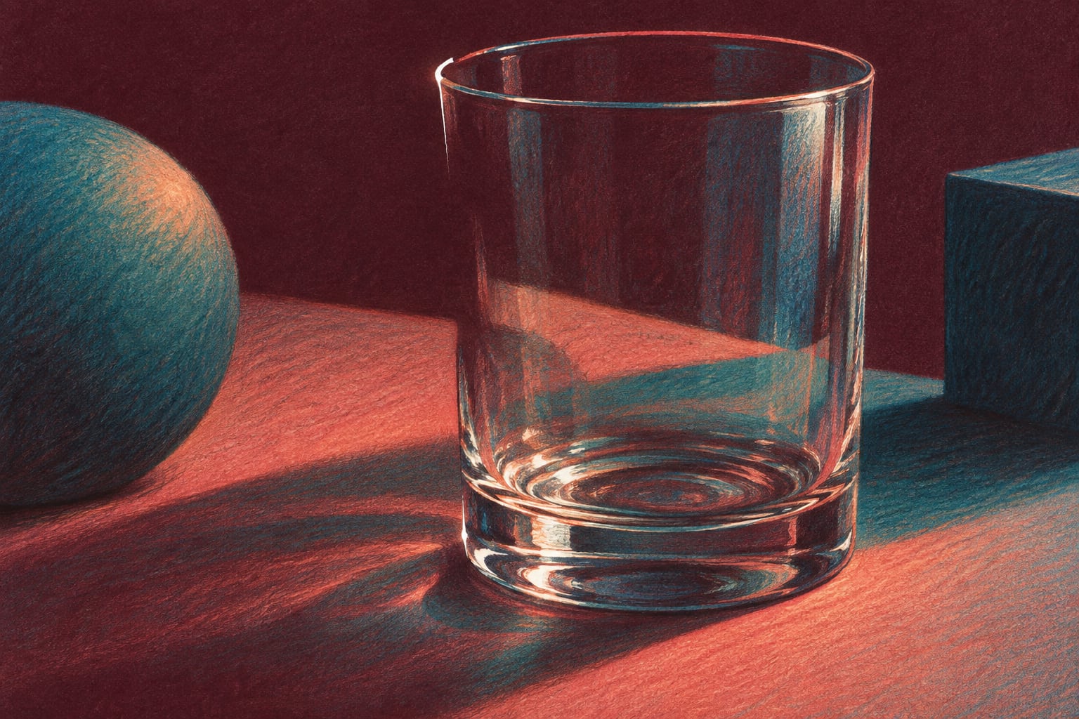
To suggest transparent glass with colored pencils, observe the reflections, preserve generous areas of paper, and strengthen only selected parts of the edge. The aim of this study is to make a simple drinking glass read as transparent with relatively few marks. You do not need to fill its entire silhouette with blue.
Place an empty glass on a stable surface and observe it from one position. Choose a plain glass without decoration or texture to reduce the decisions involved. Use dry pencils on separate paper. If you later work on a printed illustration, keep its existing lines; interrupted edges here refer to the accents you add.
Look before choosing a color
Find a bright strip, a small dark area, and a section through which you can see something behind the glass. Keep your viewing position as steady as possible. Different glasses and lighting arrangements create different marks, so study your own object instead of applying a standard set of reflections.
Getty's educational material describes color lightness and the role of lines in defining forms. Our original exercise combines these ideas through reserved paper and a few carefully placed accents. It is not intended to reproduce every optical effect that glass can create.
Make five small decisions
- Sketch a light outline: use a simple shape and leave space around it. Drawing a perfect ellipse is not the main purpose.
- Choose the reserve: find a bright strip on the glass and leave that area of paper untouched, without enclosing it in a dark line.
- Add fragments: strengthen small sections of the edge where you see darkness, allowing other areas to remain lighter.
- Suggest the base: try one or two short accents following its curve. Look again before extending them.
- View the whole study: decide whether another mark is needed or whether the glass already reads clearly.
An example that makes transparency visible
Place a colored card behind the glass. Notice which part appears through it and how that area differs from the card you see directly. In your drawing, try a small patch of that color within the silhouette, preserving the bright strip. You do not need a complete background to explore the relationship.
If the result starts to resemble an opaque cup, check how much of the shape you have covered. In another study, reduce the colored area and keep a few small accents. You can concentrate contrast in selected places without turning the entire glass into a dark shape.
Common mistakes
- Adding an equally heavy outline around the whole object.
- Placing identical reflections on both sides without checking the glass.
- Filling it blue simply because you associate that color with glass.
- Adding detail until the bright reserve has disappeared.
A common question
Can I try this on a glass already drawn with black outlines?
Yes. The printed lines will remain visible, but you can preserve the interior and limit shading to a few areas. Match your expectations to the illustration's style; you do not have to turn it into a photorealistic drawing.
Keep your study near your pencils so you can refer to it when another glass object appears. Explore more practical subjects in the Chroma Shu blog.
Conceptual source: Getty's elements of art: line and value. The glass study is an original exercise from Equipo Chroma Shu.


Be the first person to leave a little trace of color here.