
How to Build a Bold, Balanced Psychedelic Color Palette
A psychedelic palette works best with electric colors, one resting shade and repetition that connects the whole page.
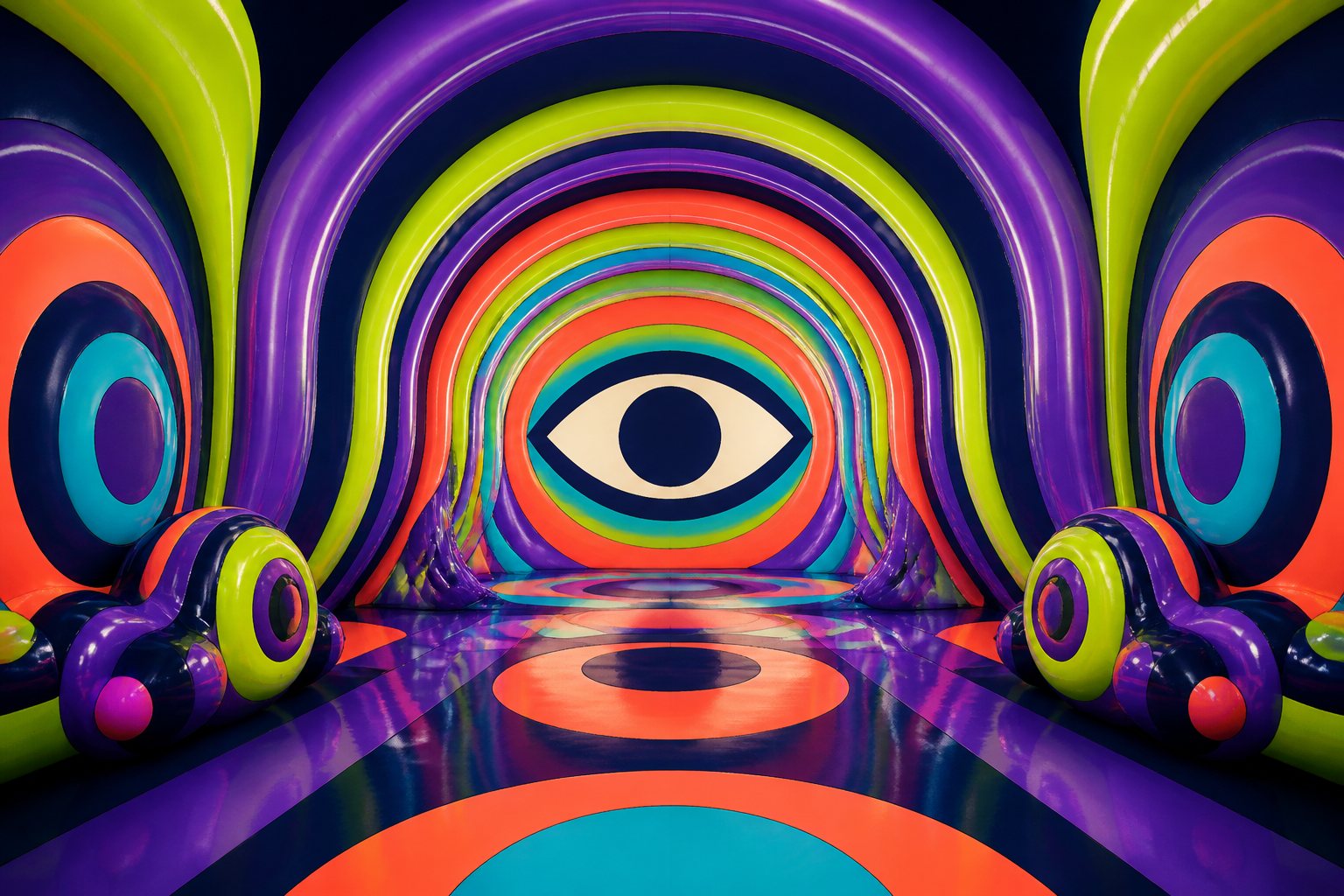
Short answer: A psychedelic palette works best with electric colors, one resting shade and repetition that connects the whole page.
Psychedelic does not mean using every color at maximum intensity. The effect comes from contrast, rhythm and a place where the eye can pause before returning to the movement.
Balance inside bold color
Choose two vivid lead colors, one or two supporting shades and a deep grounding color. Repeat the lead colors in different areas while changing their proportions. The page will feel connected without becoming predictable.
A groovy palette in five decisions
- Choose one electric color to set the energy.
- Add its contrast: warm against cool or light against dark.
- Include a deep shade for outlines and visual pauses.
- Repeat each lead color at least three times.
- Save one surprise color for small details.
Before filling the whole page, color three separate areas and look at them from a distance. If everything competes, quiet one shade. If nothing stands out, increase contrast around the area you want to lead.
Practical example: five colors for a groovy page
Choose electric violet and acid green as the lead colors. Add coral to warm the mixture, cyan to connect the cool areas and navy as a grounding shade. Use navy in outlines or smaller background areas rather than as the dominant fill. Repeat violet and green on opposite sides of the page, then reserve coral for a trail of details that guides the eye.
Common mistakes in bold palettes
- Giving every color equal space: define lead colors, supporting shades and accents.
- Forgetting value contrast: five vivid hues can still look similar when they share the same brightness.
- Adding a new color for every doubt: repeat the existing palette before expanding it.
Test the rhythm before filling the page
Color one large shape, one medium shape and one small detail. Check whether the palette guides your eye or whether everything demands attention at once. Adjusting proportions now is easier than trying to balance a fully saturated page later.
Useful micro-test: photograph the first five areas and briefly view them in black and white. If they all appear equally light, deepen the grounding shade or preserve one much lighter shape. This separates vivid hue from genuine value contrast.
Frequently asked question
Does a psychedelic palette need neon colors?
No. Complementary colors, value contrast and rhythmic repetition can create movement with ordinary materials.
Be the first person to leave a little trace of color here.