
Coloring stone with irregular veins
Combine a gentle base, broken veins, and quiet areas to suggest stone without turning every surface into a web of lines.
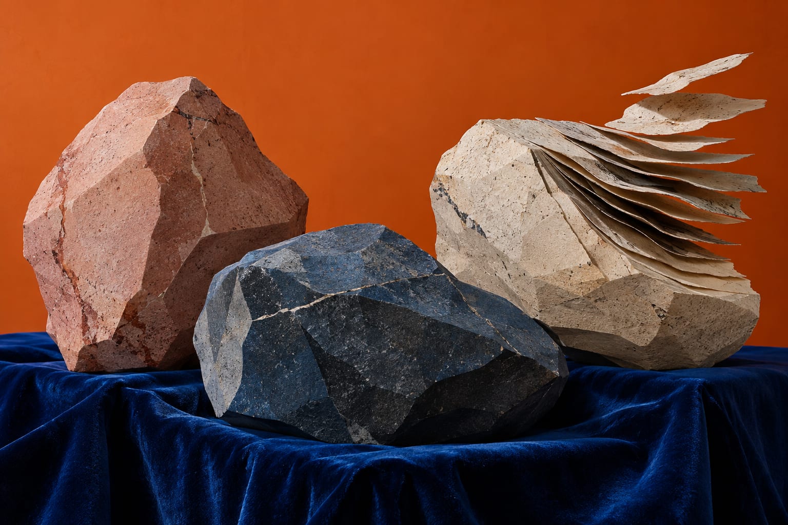
To suggest stone with colored pencils, begin with a light base and add a few veins that vary in direction, thickness, and length. Keep some areas free of marks so the surface remains readable and each irregularity has room. Try the approach on an illustrated vase, step, or rock, adjusting the scale of your marks to the object.
Choose the stone you want to imagine
A polished, veined surface and a garden rock invite different treatments. This exercise explores a pale, softly finished stone without attempting to identify a particular mineral. Choose cream, medium gray, and a darker gray or muted brown. Test them together on paper similar to your coloring page: a gray can look surprisingly different beside a warm base.
Getty describes visual texture as a quality that an image can suggest through its artistic elements. That concept provides a starting point. The pencil combination and exercise below are our own suggestions, rather than a museum recipe.
Make a sample before coloring the object
- Lay down the base. Draw a small practice rectangle and apply cream lightly. Let some paper show through. A heavily filled surface leaves less room to adjust the veins you add afterward.
- Choose one main route. Move a line from one edge toward another, changing its direction slightly along the way. Stop in one place and resume a little farther over, allowing the mark to disappear and return.
- Add a branch. Keep it shorter and thinner. Avoid spacing branches evenly; look at the whole sample before deciding whether another would help.
- Soften one side only. With light pressure, spread a little color beside part of the vein. Leave other sections crisp so the entire surface does not have the same finish.
- Introduce subtle variation. Add two or three faint patches away from the main line. Stop while broad areas of the original base remain visible.
Example: a stone planter
Imagine a wide planter. Let a vein enter from the left edge and stop before reaching the right. A fainter mark might appear near the bottom. If the illustration already has a strong shadow, avoid automatically darkening every vein that passes through it. First check how much contrast the area can hold. The texture needs to work with the shape of the container.
A small planter may need only short fragments. Copying every mark from a larger sample can overwhelm it. View the page at a comfortable reading distance and notice whether you see the object first or a tangle of stripes. If the stripes dominate, pause before adding anything else.
Mistakes that change the effect
- Parallel lines spaced evenly create a regular pattern.
- Strong black throughout the veins can make them resemble deep cracks.
- Outlining every patch hardens a variation you intended to keep soft.
- Filling the remaining spaces out of habit removes the quieter areas.
A common question
Must every vein cross the entire object?
No. Separate segments can suggest continuity. To represent a specific stone, study your own photograph or a reference you have permission to use, then choose which features to keep. This exercise offers an imagined finish rather than a geological description.
Find a simple object on your page or explore the Chroma Shu book collection. Practice on one surface first and keep the sample to compare with your next attempt.
Conceptual reference: Getty, Elements of Art. Exercises and examples are original suggestions from Equipo Chroma Shu.


Be the first person to leave a little trace of color here.