
Blend two colored pencils without a stripe in the middle
Try a generous overlap and light layers before bringing a two-color transition to a petal or sky.
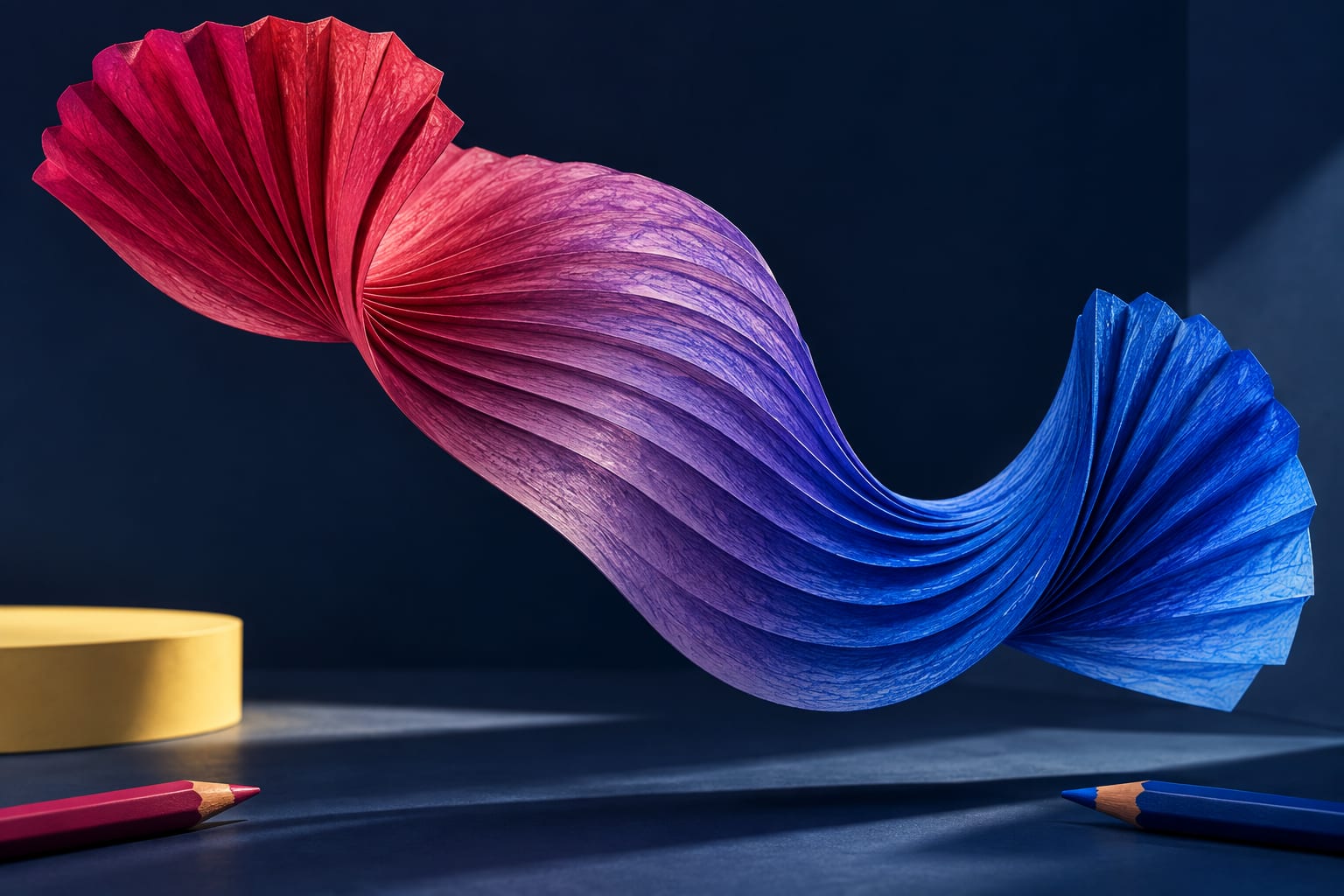
To join two pencil colors, leave a generous area where they can overlap and ease your pressure as you approach it. A boundary drawn straight across the middle can be difficult to soften later. Begin with a small study on spare paper so you can compare the transition before working on your page.
This exercise focuses on the meeting point between two colors. You do not need a perfectly smooth surface or a new blending tool. Visible paper grain can remain attractive when the color changes gradually across it.
Choose a pair you can observe
Try blue and violet, or pink and red, using familiar pencils. These are starting examples rather than required combinations. Make a sample of each color and another where they overlap. Look at the actual result: pencil names cannot tell you exactly how a mixture will appear on your paper.
Draw a small rectangle and imagine three areas: one end for each color and a shared space between them. Do not mark the divisions with dark lines. The middle is a meeting place, not a separate third stripe to fill in.
Build the transition in five steps
- Apply the first color from one end toward the center. Use light strokes and finish each pass at a slightly different point.
- Ease the pressure before reaching the far side of the overlap. Avoid stopping every stroke along the same boundary.
- Turn the paper and repeat with the second color from the opposite end.
- View the rectangle from a little farther away. Find a specific abrupt change before adding another layer.
- Adjust that meeting point with light applications. Keep the ends recognizable if you want both original colors to remain visible.
An example on a petal
Imagine a pink petal becoming violet near its base. Decide how much room the transition will occupy before beginning. A small petal may need only a few applications; squeezing in many bands could make it harder to read. First try a simple outline of approximately the same size.
If a dark line appears in the middle, do not automatically press harder over the whole area. Check whether both colors stop in the same place. On a second study, widen the overlap and stagger the stroke endings. Comparing two attempts can tell you more than repeatedly working over a heavily covered surface.
Common mistakes
- Assuming gradual means perfectly even: the paper texture can remain visible.
- Changing the pencil pair and pressure together: keep one variable steady so you can understand the result.
- Darkening both ends immediately: leave room for later adjustments.
- Treating the study as a guarantee: a larger area or different paper may need another approach.
A common question
Do I need a third pencil to connect the colors?
Not for this exercise. First see what the chosen pair can do. If you want another hue, compare it in a separate sample and check that it does not hide the transition you were aiming for.
Before working in your book, revisit how to use a color test. This is an original exercise from Equipo Chroma Shu. Keep the attempt that helps you make a decision, not only the most polished one.

Be the first person to leave a little trace of color here.