
How to Turn One Flower Into the Focal Point of Your Page
Extra contrast, detail and saturation around one flower can guide the eye without flattening the rest of the page.
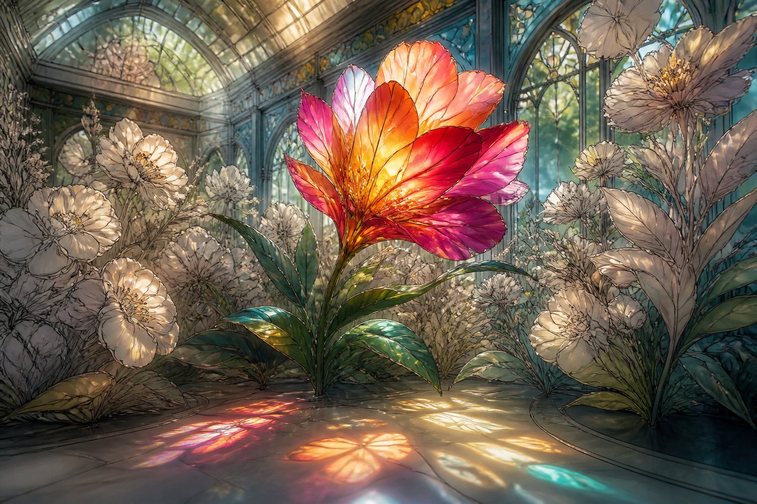
Short answer: Extra contrast, detail and saturation around one flower can guide the eye without flattening the rest of the page.
When every flower receives the same contrast and level of detail, the eye has nowhere to settle. Choosing one lead bloom organizes the composition and reduces the number of decisions you need to make.
Three ways to guide the eye
You can increase saturation, create the strongest contrast or add more texture to the main flower. You do not need all three strategies at once. If the lead bloom is very intense, neighboring flowers can share the palette in paler or quieter versions.
Build focus without losing harmony
- Choose a flower with an interesting position or shape.
- Define two lead colors and one shadow shade.
- Place the deepest contrast beside a light edge.
- Repeat the lead colors more softly in surrounding areas.
- View the page from a distance before adding more detail.
The focal point does not have to sit in the center. A flower in one corner can lead the eye across the page when its colors return as small echoes elsewhere. Let the composition guide you rather than a rigid rule.
Practical example: a lead dahlia
Color the center in garnet and move toward vivid pink across the middle petals. Keep pale coral along the edges and add a few cream accents where you imagine the light. In neighboring flowers, repeat pink and coral with lighter pressure and leave out the garnet. The palette remains connected, but the dahlia keeps the deepest contrast.
Common focal-point mistakes
- Adding equal detail everywhere: allow secondary areas to stay simpler.
- Completely isolating the lead flower: repeat part of its palette nearby so it belongs to the page.
- Confusing size with importance: a small shape can lead when it carries the strongest contrast.
Use the background as support
If the background is complex, reduce its saturation near the focal flower or create a slightly lighter area behind it. You do not need to erase lines or change the drawing; a gentle value difference can separate the flower while keeping the rest of the garden visible.
Check the hierarchy: glance at the page for one second, look away, then return. Notice which area you see first. If it is not the chosen flower, strengthen only the closest contrast around it before adding more color elsewhere.
Frequently asked question
Do all the other flowers need to be neutral?
No. They can still be colorful; they simply need to compete a little less through softer contrast, detail or saturation.



Be the first person to leave a little trace of color here.