
How to Use Coloring Inspiration Without Copying the Result
Study one idea at a time—palette, contrast, texture or mood—and translate it into your own decisions instead of reproducing it.
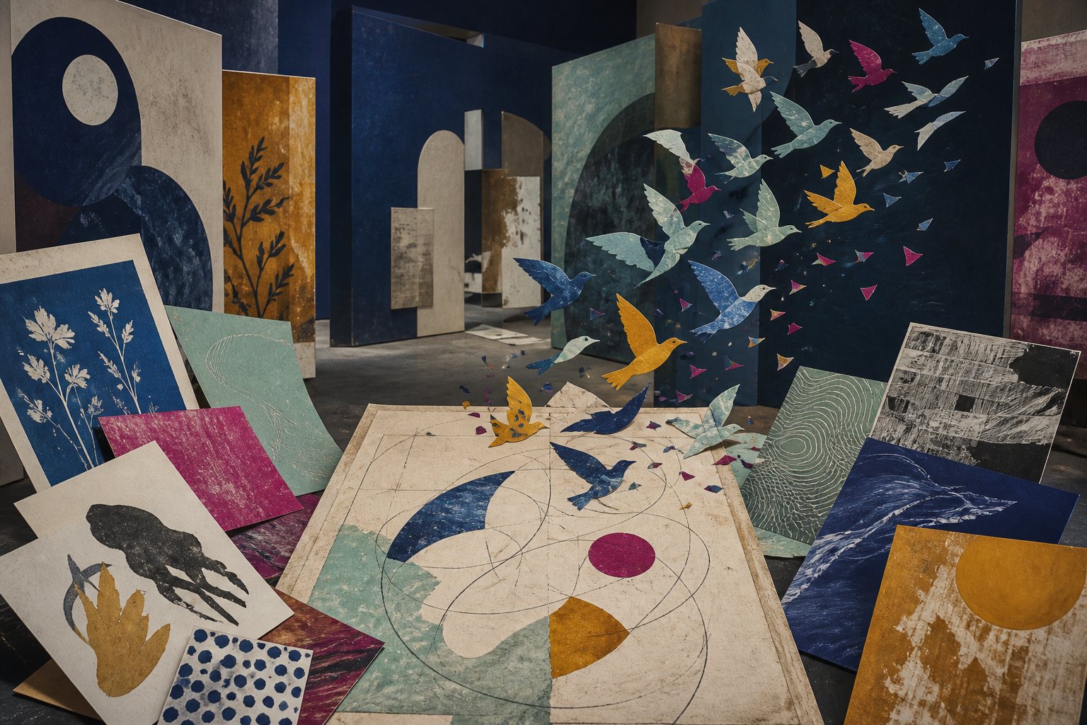
Short answer: Study one idea at a time—palette, contrast, texture or mood—and translate it into your own decisions instead of reproducing it.
A colored image can open possibilities when you do not know where to begin. It can also create pressure if you feel your page must look the same. The way through is to treat the reference as a set of questions, not a required answer.
What to notice in a reference
Ask which color dominates, where contrast appears, which areas feel quiet and what texture gives the piece its character. Then keep only one of those ideas and change the others. If you borrow the palette, alter the distribution; if the light inspires you, use different colors.
Turn inspiration into your own decision
- Look at the reference for one minute, then put it aside.
- Write down the single idea you want to keep.
- Change at least two elements: palette, medium, distribution or texture.
- Make a small test before looking again.
- Compare to learn, not to score your result.
Chroma Shu inspiration galleries are designed as doors, not molds. Your tools, your pressure and even the light in your home already turn the page into something different.
Practical example: keep one idea and change three
You find an inspiration image with coral flowers on a turquoise background and respond to its energy. Keep the warm-cool contrast, but replace coral with orange, turquoise with navy and the smooth finish with visible pencil layers. You might also move the strongest color from the center to the corners. The relationship that inspired you remains, yet the result tells a different story.
Common reference mistakes
- Keeping the image visible for the entire session: putting it aside makes room for your own decisions.
- Comparing different materials: a marker will not create the same texture as a pencil.
- Demanding an exact copy before you begin: a reference should open options rather than close them.
Build a library of ideas, not finished results
Instead of saving only complete images, write down what interested you in each one: “violet shadow,” “quiet background,” or “three repeated colors.” Those observations combine more freely and gradually reveal your own preferences.
One final question: when the reference is removed, can you name one decision that is yours? It might be the distribution, material or mood. Identifying it helps you recognize your own voice without rejecting the inspiration that helped you begin.
Frequently asked question
Can I use exactly the same palette?
Yes, if it helps you begin. Make it yours by changing proportions, order, texture or intensity, and allow the process to take a different direction.


Be the first person to leave a little trace of color here.